UX design isn’t a linear process.
I design how digital products and humans interact with each other, and help spread the smile when dealing with digital products (I call it human experience design). I apply a user-centred design approach to customer problems and bring ideas to life. Being able to combine my previous experience in business and marketing with UX helps me create thoughtful experiences.
UX is the sum of all things
Simple, minimal and effective — that’s my mantra. By using the levers of friction and flow to influence behaviour, I bring together form and function to create something that is aesthetically pleasing and performs well. I believe that a good user experience is the foundation of a good customer experience. I help design experiences that put the user first.
How I prefer to work
I prefer working directly with the ‘end-user’. This enables me to create solutions that are genuinely desirable and viable for the business and the users. In practice, this means a lot of ideation sessions, workshops, design sprints, experiments and prototypes... Read on below to see how I work…
My UX Process
My UX design process typically follows something similar to a design thinking approach, which consists of five basic phases: Empathise with the users (learning about the audience), Define the problem (identifying the users’ needs), Ideate (generating ideas for design), Prototype (turning ideas into concrete examples), Test (evaluating the design).
Design Thinking starts with empathy, a deep human focus, in order to gain insights which may reveal new and unexplored ways of thinking and a more holistic approach to problem solving. The beauty is that design thinking encourages collaborative, multi-disciplinary teamwork to leverage the skills, personalities and thinking styles of many in order to solve multifaceted problems. I consider Design Thinking as a process that you go through to create solutions. Whereas, I would define Human-Centred Design as a mindset that overlays design thinking to ensure that the products are actually relevant and beneficial for the intended purpose.
Creating good UX design means focusing on the user.
User Personas
A user persona is a powerful UX research tool. I usually define personas as the first output from the initial discovery phase of a project. Persona research provides rich insight into the mind of a user. Psychographics help to add a layer of empathy and realism when exploring a user’s needs and goals - ultimately aiming to help align a team what users want in order to make informed decisions about a product.
Customer Journeys
A user journey map is a visual interpretation of the overall story from an individual’s perspective of their relationship with a company, service, product or brand, over time, across channels and touchpoints. Outlining how the customer experience could be brought to life allows me to better understand the essence of the end-to-end experience.
User Flows
In contrast to the customer journey map, the user flow diagram considers only what happens with the product/service. A user flow represents users' movement through a ‘product’. It helps to map every step users take —from the entry right to the final interaction. Think flows, not screens. User flow diagrams help me evaluate the efficiency of the process needed to achieve a user goal.
Experience Maps
Developing an understanding of each customer touchpoint means that I can design better customer experiences. This understanding can also be used to enhance user and customer journey mapping exercises. By laying the experience out along a timeline, I can understand the journey in context as well as the motivations, problems and needs along the way.
Empathy Maps
Empathy maps capture users’ emotions, hopes and fears, and distill knowledge of the users into one place. Empathy mapping focuses the team on the underlying “why” behind users’ actions, choices and decisions. Empathy allows me to design with intent, introduce focus and clarity, advocate on behalf of users, and challenge my assumptions.
Personalised Experiences
I am an advocate of building experiences around customer journeys. Creating tailored, real-time experiences (based on users’ preferences and behaviour) allows me to cater to individuals - to help, guide and move visitors through the customer journey - and deliver the right content to the right people at the right time.
User Personas and Empathy
Understanding users means building empathy for human beings who experience the product or service. Empathy enables me to understand not only the users immediate frustrations, but also their hopes, fears, abilities, limitations, reasoning, and goals. It allows me to dig deep into my understanding of the user and create solutions that will not only solve a need, but improve the users’ experience by removing unnecessary friction.
Personas encourage everyone to design for real people, rather than faceless and homogenous users. Real people have needs, motivations, emotions and frustrations (among other things) that can be captured and communicated using personas – things that are all too often lost when speaking about generic ‘users’.
Personas by their very nature also provoke discussion and dialogue about users. Would Kirk find this feature useful? Do you think that Steph would be able to make a booking on this platform? People love talking about people and by using personas you’re giving everyone in the team the platform to do just that.
User Flows, Journeys, Experience Maps
Prior to drafting a journey map, I usually create a customer touchpoint map outlining points of contact, interaction and channels; and “Moments of truth” – the positive interactions that create good feelings in customers that can be used at touchpoints where frustrations exist. Putting the customer at the heart of the business means that every procedure, process, product and service keeps the customer in mind.
I have come to realise that customer journey maps are in fact very useful beyond UX design. They help me facilitate a common business understanding of how every customer should be treated across all customer touchpoints (marketing, sales, service, logistics, distribution, etc.) to educate stakeholders as to what customers perceive when they interact with the business — what customers think, feel, see, hear and do and also raise some interesting “what ifs” and the possible answers to them.
Sitemaps and Information Architecture (IA)
Sitemaps show the hierarchy and navigation structure of a website / mobile app. I produce sitemaps to show how content will be organised into ‘screens’ or sections, and how the user may transition from one section to another.
Sketches, Wireframes and Prototypes
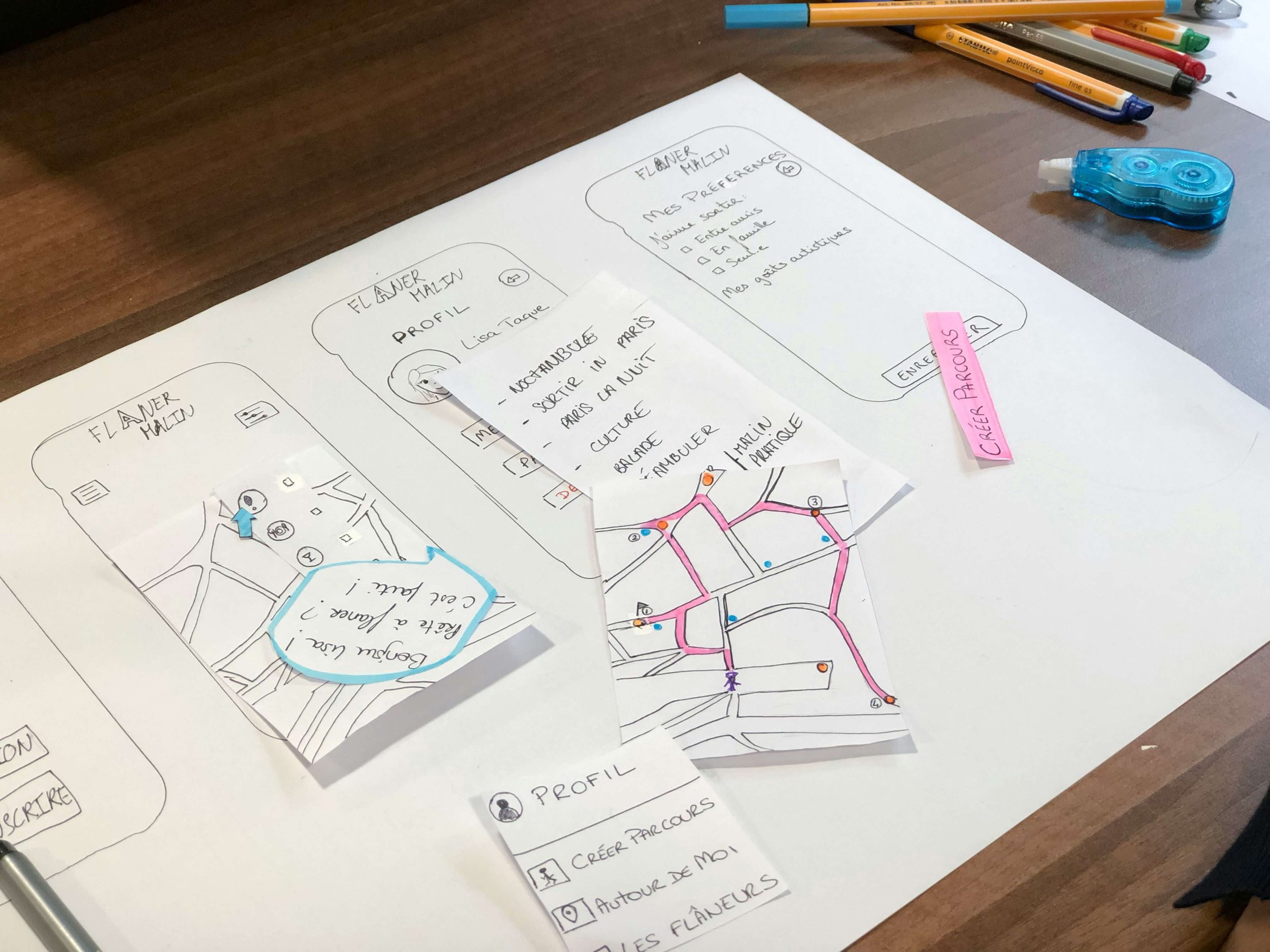
The wireframe creates the structure - the backbone - of an entire project layout, which takes into account user needs and user journeys. They're stepping stones to interactive prototypes. The benefit lies in visualising the structure of a concept. My UX process includes low and high fidelity wireframing. A low-fidelity wireframe omits any visual design details and serves as a rough guide to allow designers to get a feel of how and where they should place content. High-fidelity prototypes are a step up from low-fidelity wireframes and are pretty close to pixel-perfect — often in the form of a prototype that captures the user flow process and demonstrates interactivity. I usually start my wireframes with a sketch or a micro-frame which amplify the benefits of wireframing.
User Interface Design
Depending on the type of project, I sometimes get involved in user interface design. In my humble opinion, UX applies to anything that can be experienced — be it a website, a coffee machine, or a visit to the supermarket… However, I am in the camp of UXers who clearly distinguish between UX and UI design. UX design is not necessarily about visuals; it focuses on the overall feel of the experience. There are very close similarities between the two functions. The goal of UI design is to visually guide the user through an interface. UX - to a large extent - is all about creating an intuitive experience that doesn’t require the user to think too much! As a UX designer I consider the user’s entire journey to solve a particular problem. My experience and background lies in both camps, however, my core experience is UX. That being said, UX and UI go hand-in-hand.
Usability Testing
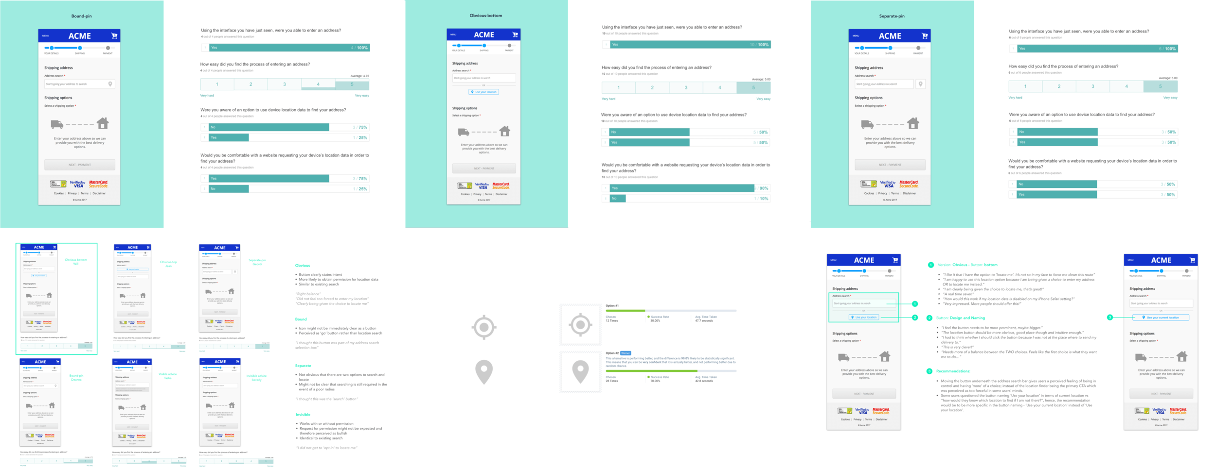
Being customer obsessed means to pay attention to what users do, not just what they say. Usability testing is a powerful technique to check how usable an interface is with actual user and can be used in a variety of ways during a project lifecycle.
I perform usability testing to compare (e.g. to compare the usability of one website with another), to explore (e.g. to establish what content and functionality a new interface or product should include to meet the needs of its users) and to evaluate (e.g. to ensure a new product is intuitive to use and provides a positive user experience).
Analysing customer feedback is important as it helps me not only get to know the customer better but also increase customer engagement and loyalty. User feedback helps to collect insights to improve the overall customer experience and to create meaningful modifications to make the product delightful and easy to use. By giving the customer an avenue to provide feedback directly, it helps them feel heard. Seeing user feedback implemented not only creates a two-way communication channel but also builds trust.
I consider usability testing as a key part of the design process which can defined by 5 components: learnability, efficiency, memorability, error, and satisfaction. In a nutshell, usability is an essential factor that plays a vital role in success of a product.
Great usability is a significant contributor to a seamless user experience. I often test site usability using a heuristic analysis with the goal to improve the user’s satisfaction and experience. Unlike user-testing, where the site (or prototype) is evaluated by users, I perform a heuristic evaluation which is based on a set of predetermined heuristics or qualitative guidelines. While there are +200 criteria by which a site can be evaluated, many evaluation questions are based on Jacob Nielsen’s 10 Usability Heuristics for User Interface Design.
Another great inspection method I use is a cognitive walkthrough. Here the emphasis is on specific user tasks. This allows me to identify and assign a “severity rating” to each of the usability issues identified.
CRO + Experience Analytics
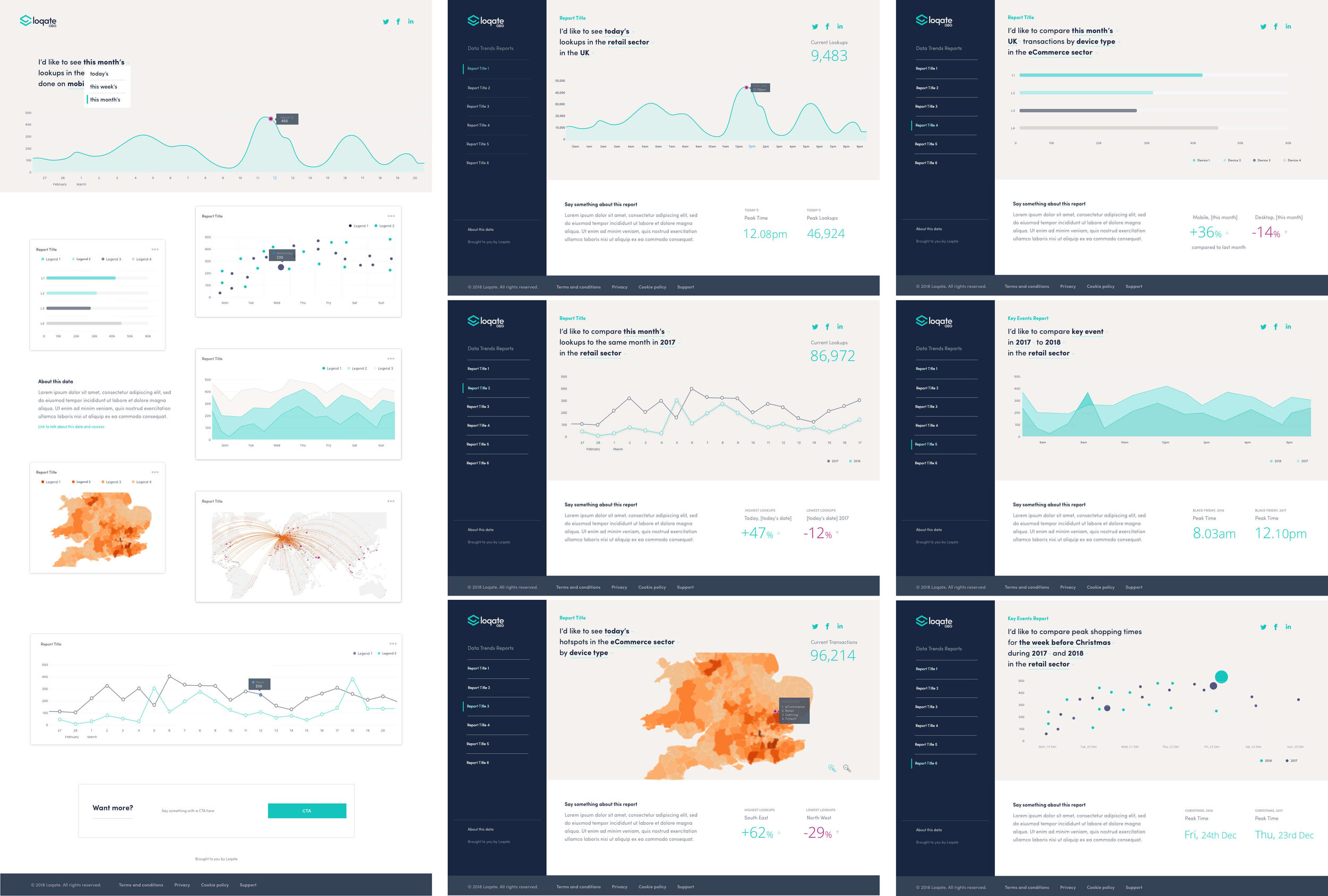
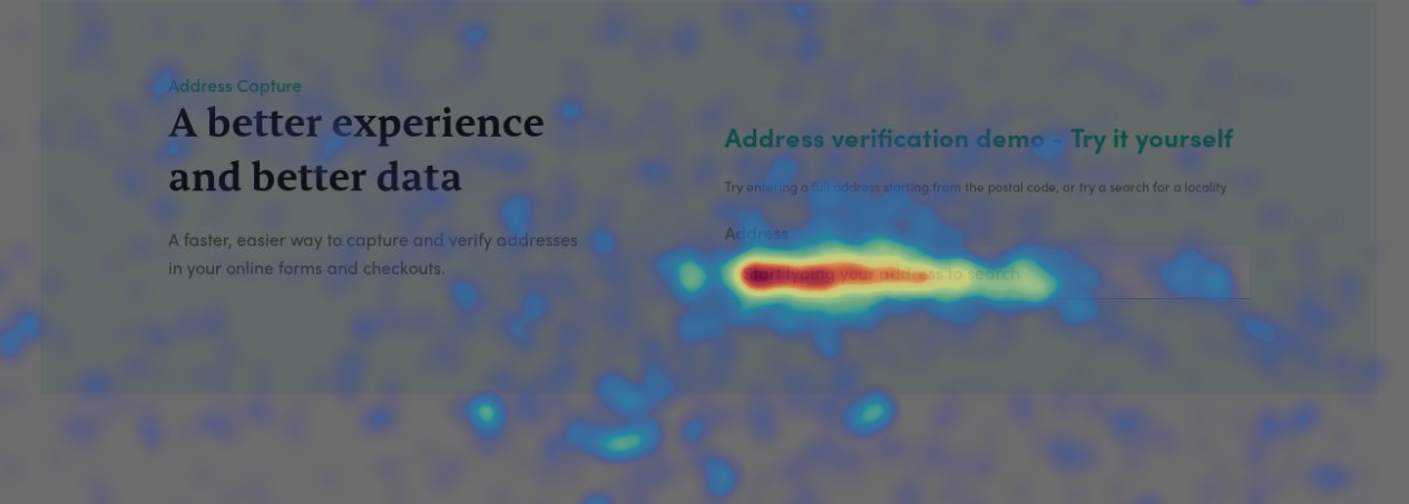
My focus in performing Conversion Rate Optimisation (CRO) is to optimise a website’s user experience to get more visitors to take a specific action, and increase conversions. Applying CRO techniques allows me to transform ‘millisecond-level behaviours’ into meaningful insights, and ultimately design the experiences customers want. It takes the guesswork out of what affects user behaviour, pinpoints elements causing friction, and reveals journeys for behavioural segments, journeys from and to certain goals. CRO answers questions such as:
How do users interact with each element on each page?
Why are visitors bouncing?
Is a new site or page design positively or negatively impacting site goals?
How can I measure the performance of content live on site?
How can I improve campaign conversions?
CRO is very much an ongoing practice of experimenting, learning, optimising and constant iteration testing. Mapping out what routes a visitor might take to become a customer is key to figuring out which stages need to be optimised. My key tasks relating to CRO include the following: identify trends and problem areas, analyse and optimise key customer journeys, create test plans, build an ongoing optimisation roadmap, and provide next-step recommendations including best practice UX practice. CRO is all about using data-backed insights to make improvements.
I tend to use analytics derived from tools such as Google Analytics, Contentsquare, Hotjar, Crazy Egg or Mixpanel.
User Research
Great UX design is driven by user insights. User research helps me to remove bias by learning about the user from their perspective, experiences and mental models. I strongly believe that empathy is the key to user-centered design; it allows me to see things from someone else’s perspective. I find research particularly helpful in creating a shared understanding of the user’s needs, making it much easier to work towards the same goal in a team.
CX + VOC + HX
Customers want simple, consistent, and relevant experiences across all interactions throughout the lifecycle. Gone are the days when interacting with customers was primarily a face to face or on the phone or in store experience. Engaging customers is a LOT more complex today. Business has moved from the traditional sales cycle to a buying cycle with control of the customer relationship now very much in the hands of the empowered consumer. This is why the CX (Customer Experience) matters more than ever before. I am a big advocate of learning about the drivers of human behaviour as people interact with digital experiences - I call it HX (Human Experience).
Managing the end-to-end customer experience and evoking positive feelings requires a disciplined and dedicated approach. My CX goals focus on the following:
Create a consistent voice
Build connected interactions
Personalise the customer journey
Establish rewarding customer relationships
CX efforts come in many forms, from surveys and dashboards, to journey maps and action planning. I am a big advocate of creating value through transforming touchpoints and customer journeys by using behavioural psychology to manage customer expectations — and seeing the world through the customer’s eyes.
By connecting real-time customer signals to every phase of a lifecycle, I can make data-driven decisions, align on priorities, and deliver better digital experiences.
I use CX and VOC (Voice of the Customer) platforms to make sense of an experience; quantify user behaviour and capture sentiment using tools such as Quantum Metric, Contentsquare and Medallia.