I design with people in mind, rather than focusing purely on the mechanics of the product itself.
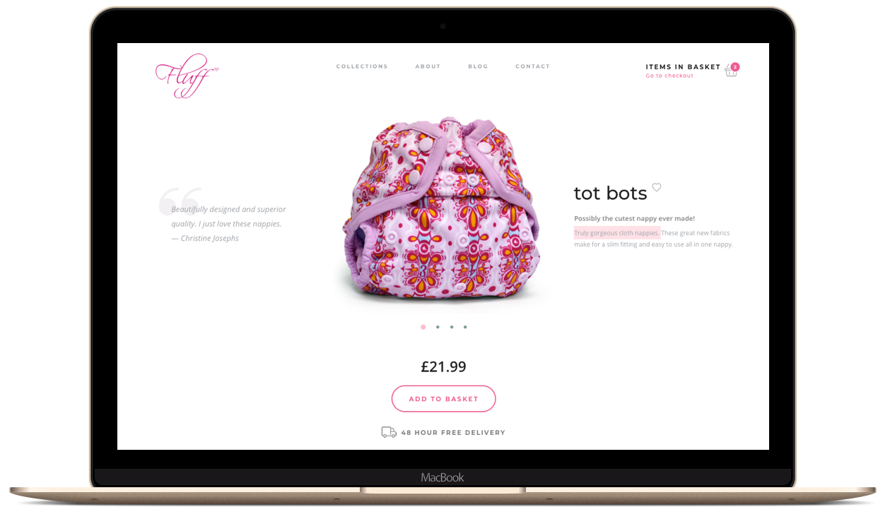
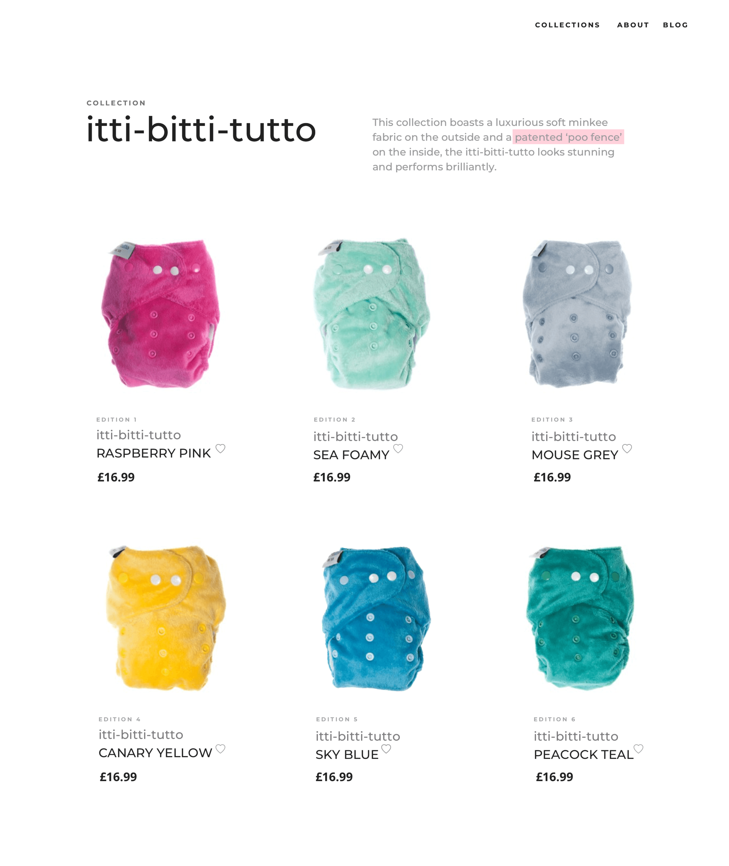
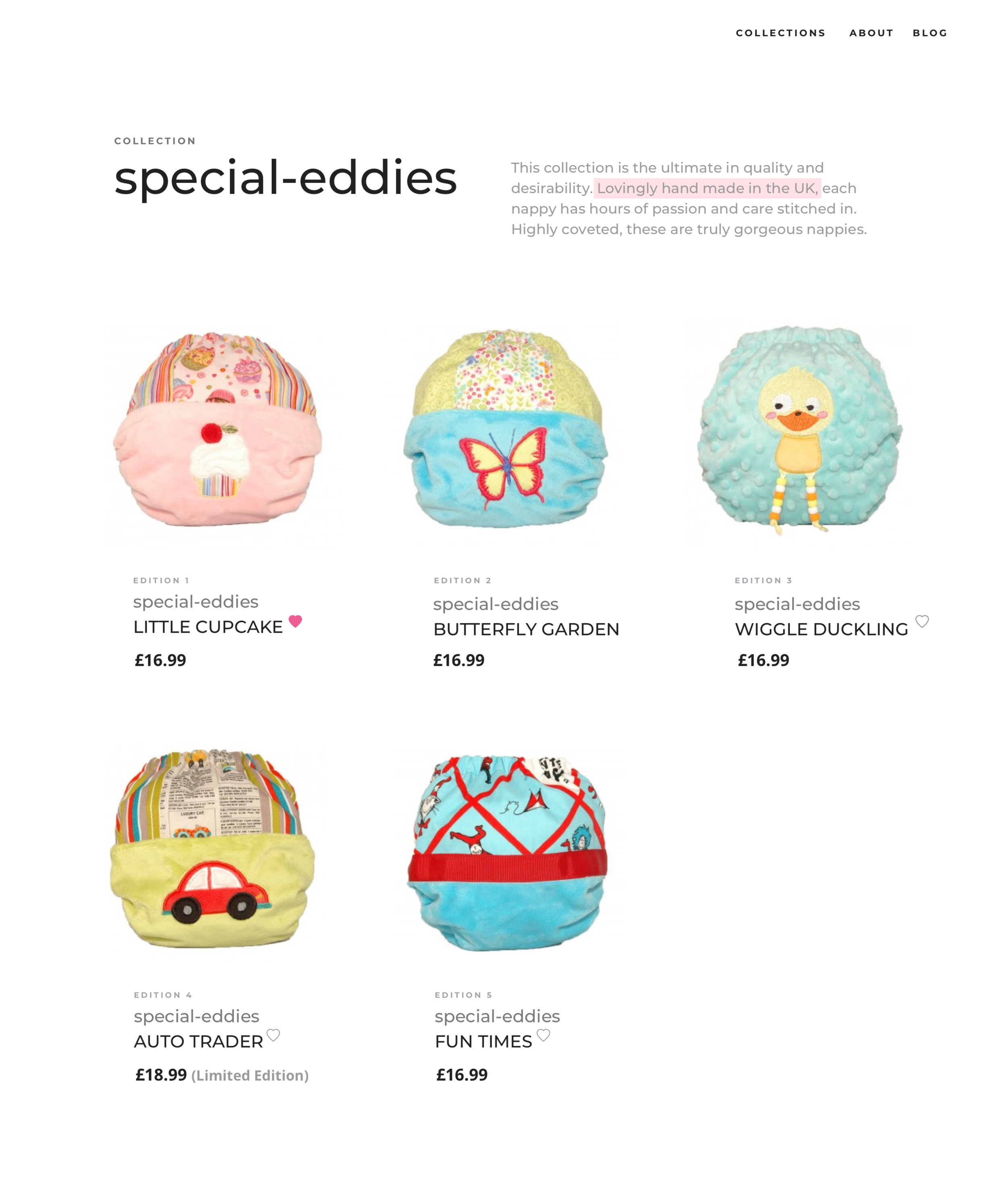
The concept: Sell a collection of the most gorgeous and desirable modern cloth nappies from around the globe. The challenge: Design an online store for a new brand that displays the following traits — Fun, but not silly. Hip, but not tacky. Easy, but not simplistic. The goal: Create an online store with personality that manifests itself in an interface through simplicity, visual design, copy, and interactions. And so I set out to craft an emotionally engaging experience that creates a lasting impression.
This project included: Competitive Analysis, Personas, User Flows, Information Architecture, Card Sorting, Tree Testing, Wireframing, UI Design, Heuristics and User Testing, Branding
Create a superior experience
Functionality and usability should always be the priority in providing the foundations for any user interface. I like adding another layer — emotional design — to evoke a response, connect with, and delight the users. This additional layer will always result in a superior experience.
Emotional Design in eCommerce
From the outset of this project I recognised the importance of first understanding the intended users of the products and then empathising with them. I adopted an emotional design strategy that allowed me to create something unique that evokes a positive response in users; and added a personality layer. My goal was to incorporate a pinch of emotional design as a powerful tool in creating a bit more of an exceptional user experience; and for the design to be both usable and aesthetically pleasing or even ‘pretty’ (and Fluff’s attractive products made that process so much easier).
I created empathy maps that helped me climb into the mind of potential customers. They allowed me to go beyond personas by mapping what an individual customer might think/feel, see, hear, say/do, their pain points, and what they have to gain. It was so important to understand how the customer journey makes users feel — it really was a very human-centric process (I call this process ‘Designing With Heart’).
Creating the Brand
The key was to cultivate a strong emotional connection between the brand and the customer. The branding colours had to provide a shortcut straight to the users’ hearts. But colour theory in itself goes a lot deeper than ‘pink is a pretty colour’. After conducting some ad hoc user research, I started to see a trend in preferences in my target audience. Pink. Pink with a twist! Raspberry Pink formed the ideal brand personality — and encapsulated the desired brand traits: Fun, but not silly. Hip, but not tacky. Easy, but not simplistic.
From Low to High Fidelity Design
I started my design process with low fidelity page layouts, navigation systems and user flows of interactions clearly without too much UI details. It helped me test assumptions and find invisible UX issues quickly. Low fidelity moved into high fidelity and into development - built on the Shopify eCommerce platform (the store was brought to life in code by Marc, the developer).
User Interface Design
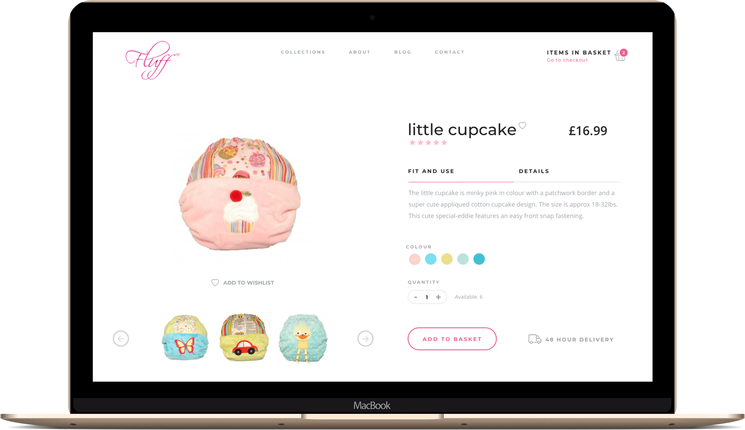
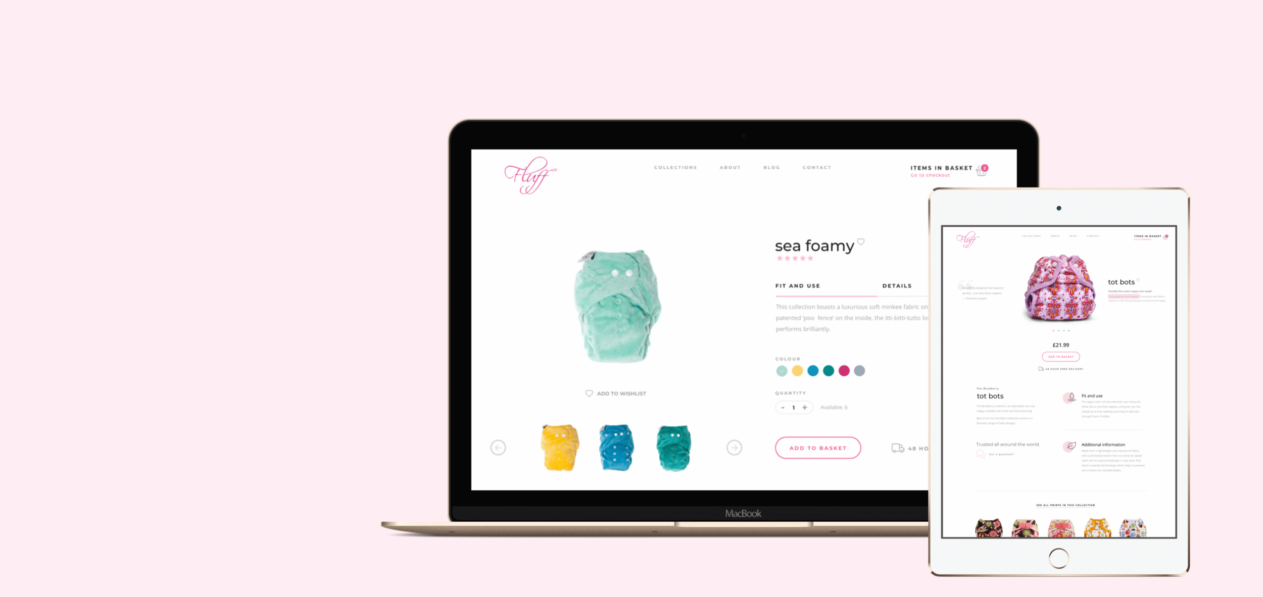
I created an interface that is clean and leaves the user free to focus on the products with no distracting bells and whistles. I reduced the number of stimuli to encourage a faster decision-making process and I adopted the ‘K.I.S.S.’ (‘Keep It Short and Simple’) principle. Simple and uncluttered. But … ‘simple design’ doesn’t mean less design. It means easy (and intuitive); and can create an appealing, effective, pleasurable and (hopefully) a more memorable experience.
I tried (a little) to break the barriers that exist between man and machine … by injecting a layer of personality using positive emotion in the design. All too often it is an afterthought that gets pushed to the end of the development process, but microcopy provides a really simple way to assist users as they interact with a site. I used this little technique to provide an opportunity to convey a sense of personality and add lovely little bits of subtle delight to the user experience …
Optimising for Conversion (CRO)
Conversion optimisation was embedded throughout the e-commerce journey, from product discovery to checkout completion. Through extensive user testing, including usability studies and live user feedback, I identified friction points that could hinder conversions, such as complex navigation or lengthy product descriptions. I ran A/B tests on product page layouts to find the most effective presentation of product information, adjusting the visual hierarchy to highlight key selling points like price, features, and customer reviews.
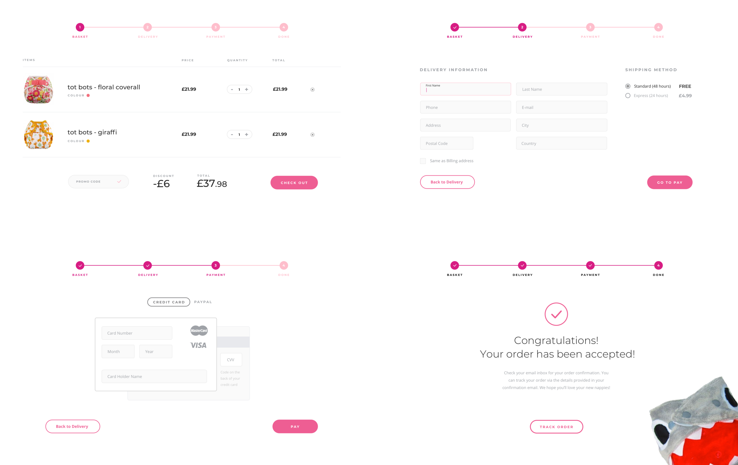
By testing different CTAs, I determined which phrasing and placement drove the most conversions, ensuring users were always one click away from completing their purchase. I also optimised the checkout process—reducing form fields and streamlining payment options—based on insights from heatmaps and session recordings that showed where users hesitated or abandoned the cart.
This data-driven approach allowed me to fine-tune the entire product journey, resulting in a seamless experience that reduced friction and improved conversion rates.
eCommerce Checkout
At the other end of all your strategy and metrics and the final step - the checkout, there are real people. My aim was to design a checkout experience that was intuitive and carried the company branding and ethos to the final step of the journey - that would leave a smile in the heart of the customer - a transaction with a bit of heart…
The challenge
As a UX designer, I had to be the voice of the user and my design decisions had to reflect the users’ expectations. The biggest challenge was to truly understand the user and their decision-making processes. To succeed, I had to accommodate the users’ constraints and tailor the experience to their explicit and implicit needs.
Key takeaways
Without knowing a prospective audience, designing something relevant that is both usable and pleasurable will be quite tricky. Empathy is essential to truly understand and uncover the latent needs and emotions of users. Don’t let the machine rule! Build a little emotion into the experience. Remember, people build emotional connections to other people — not machines.

