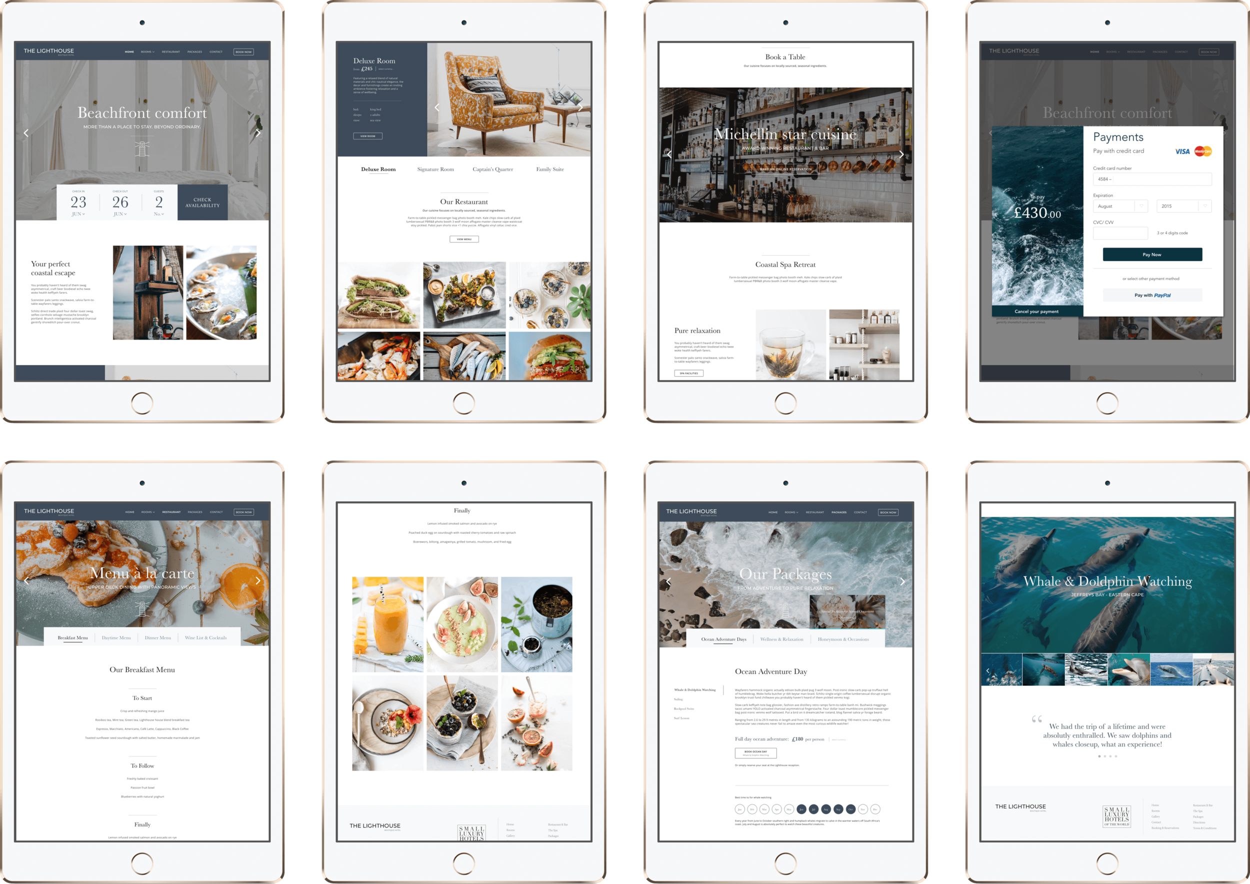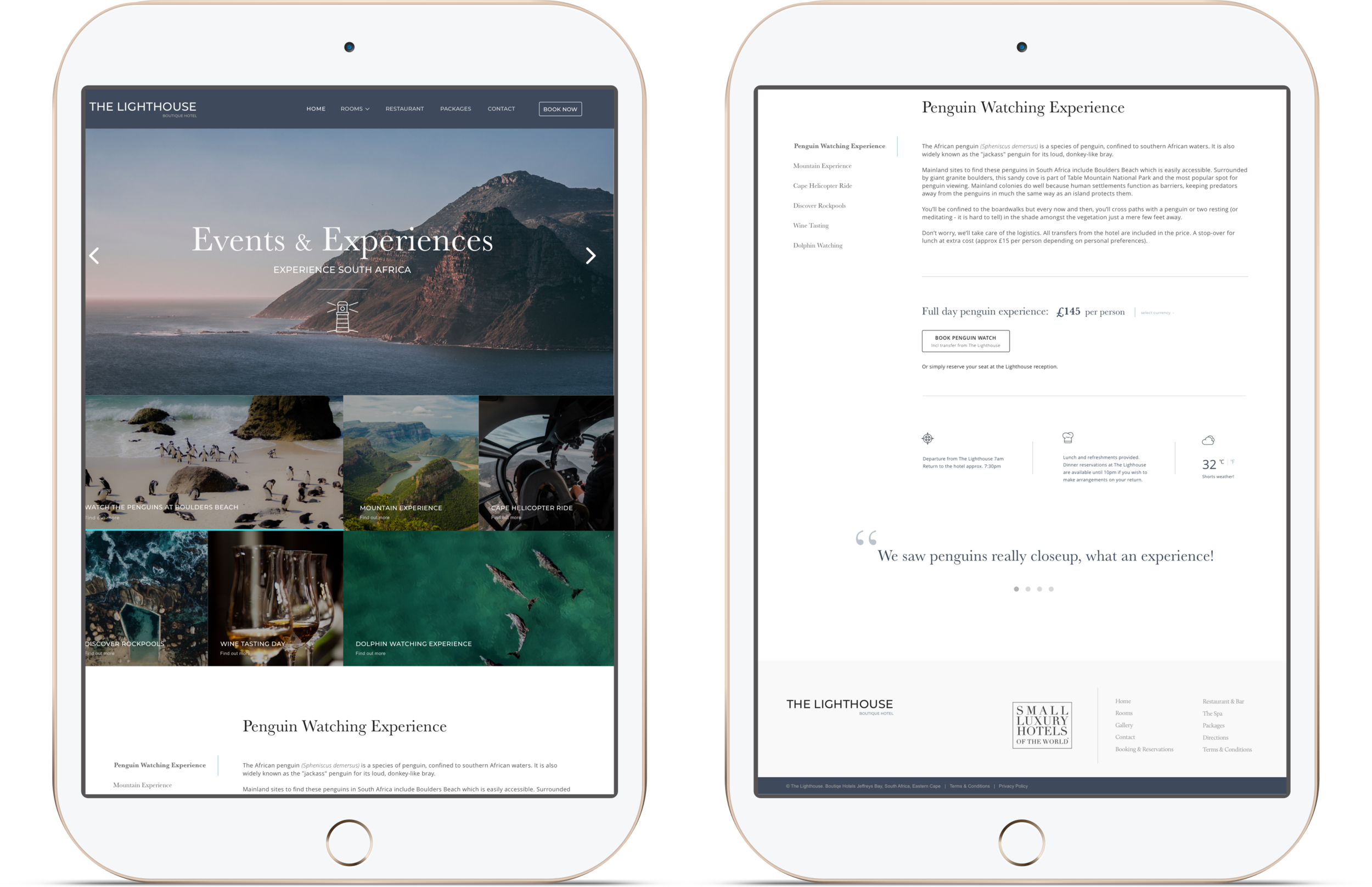
Put the user’s needs first by prioritising them in every aspect of the UX design – give the user everything they need to make a booking decision as easily as possible.
The Lighthouse offers a boutique-style travel experience in the Eastern Cape, South Africa. My task was to create a luxury travel booking experience (end-to-end) for guests wishing to stay at this stunningly gorgeous, boutique seaside hotel. The Lighthouse offers a truly unique stay where an authentic, cultured atmosphere pervades - with an indulgent onsite spa experience. The restaurant prepares some of the finest local ingredients. The Lighthouse offers a range of carefully selected, magnificent day experiences ranging from whale watching to wellness days.
Keeping hotel booking simple and elegant can be a complex task; and good UX design played a major part in securing bookings. Potential visitors need useful and reliable content to inform them about their stay at the hotel, a usable, intuitive user interface (UI) that they can operate easily, and a clear, familiar, logical path to navigate from research to booking their stay. Good UX for hotel booking means minimising or eliminating friction points by creating a logical user journey that they can trust.
This project included: Competitive Analysis, User Personas, User Flows, Wireframing, User Interface Design, Heuristics and User Testing
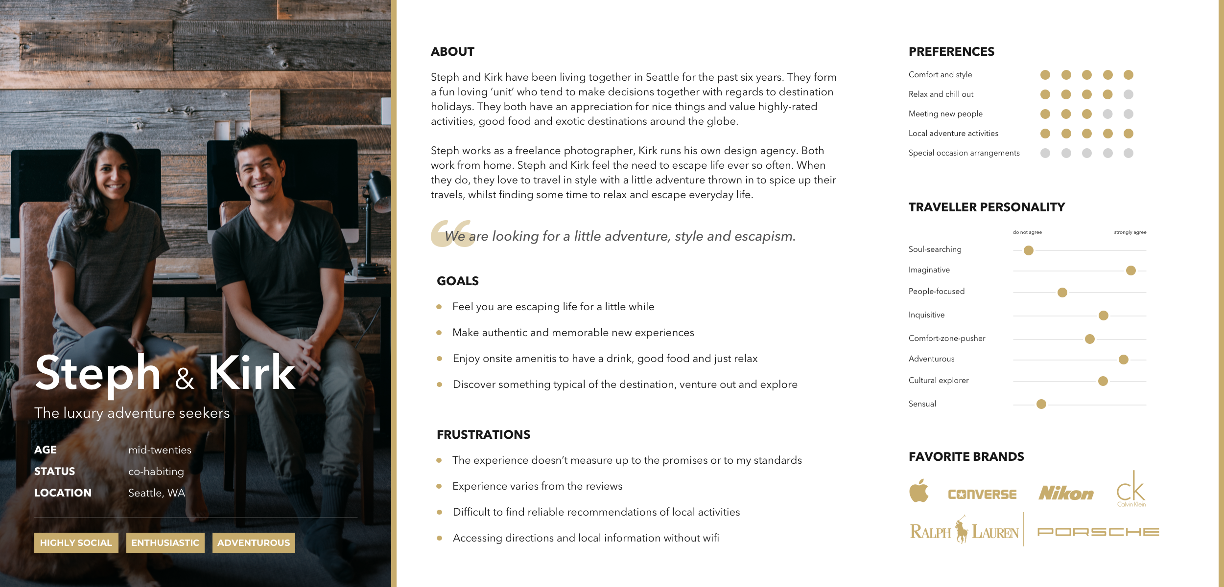
User Personas
Considering the significant investments that go into planning a trip, trust is essential as well as anticipating the user’s needs such as informative, quality content – and it increasingly means addressing ever greater user expectations. This meant that the site needed to present straightforward and clear travel information, helpful logistical details, and tips that will help visitors simplify their travel process.
I learned that the ‘ideal guest’ for this location has a desire for an authentic local experience. I cultivated this desire by incorporating local experiences to set the scene for an elevated guest experience. Typically, guests at The Lighthouse would prefer to book private tours as opposed to larger group trips; so I had to be sure to make all of the trip info easy to find throughout the browsing and ultimately, the booking process as these guests were planning their trip in advance, making sure every detail is ironed out.
I identified 2 personas which have different needs and different goals. I adopted a slightly unconventional approach to personas which I had based on couples making a booking decision together - as a unit. This insight was very useful to improve the user experience for each one of them and cater user expectations to actual user needs and decision-making patterns.
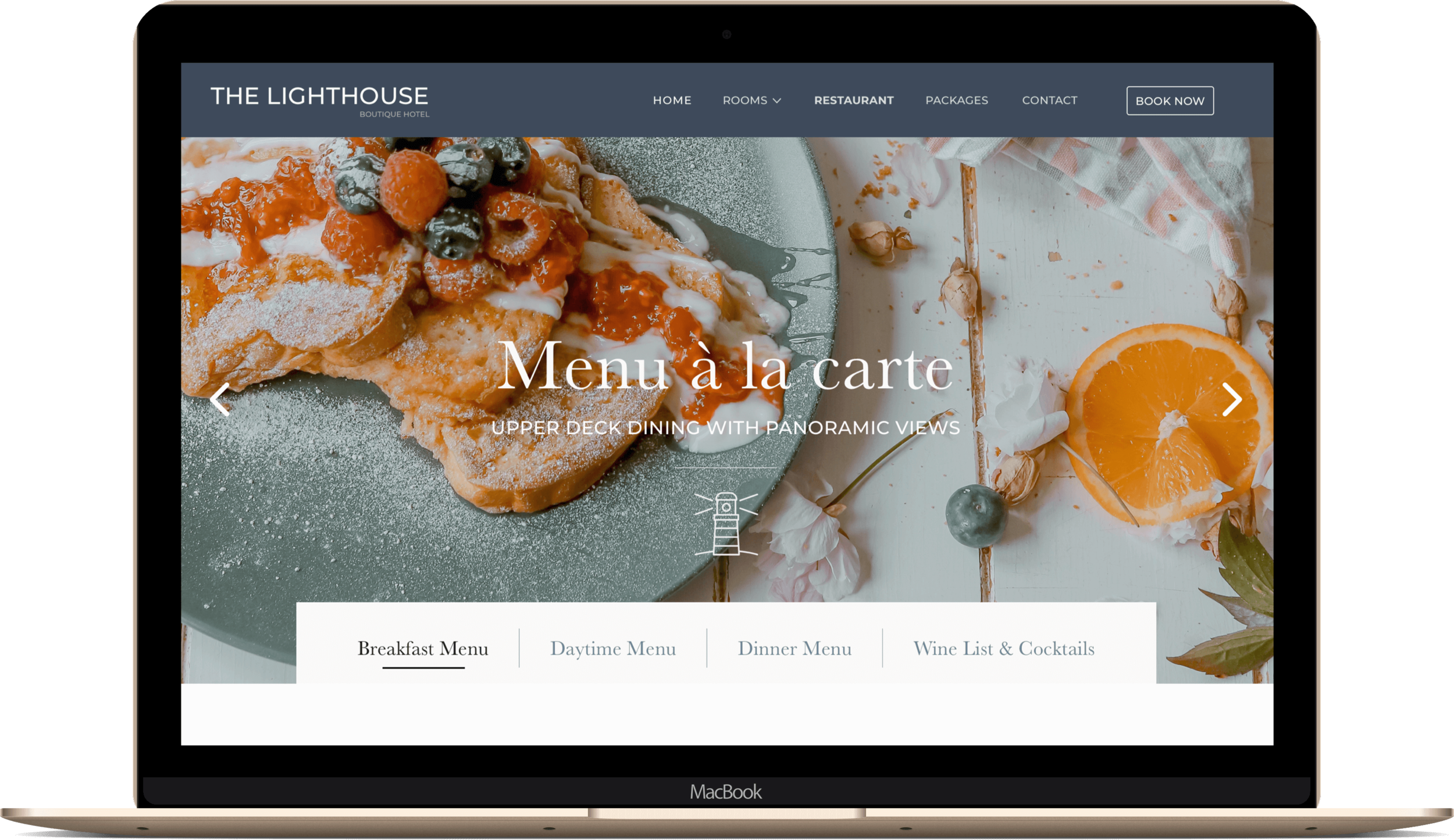
An immersive hotel booking experience
Especially for boutique hotel bookings, visitors will want to know what separates this hotel from others and the website needed to clearly note these unique ‘selling points’.
Conversion Optimisation (CRO)
For The Lighthouse project, CRO wasn’t just about tweaking buttons—it was about crafting an experience that truly resonated with the audience. I tested different ways to position and present experiences, balancing inspiration with clarity to ensure users felt intrigued rather than overwhelmed.
A key focus was determining what information to present (and how much) to keep the experience inviting and intuitive, all while aligning with the previously defined user personas, their ambitions, and expectations. Heatmaps played a crucial role in analysing how users absorbed content—where they lingered, what they skimmed, and what they ignored. These insights helped refine the layout, content hierarchy, and CTA placements to guide users seamlessly towards engagement.
The result? A thoughtfully optimised experience that felt as effortless as it was compelling.
The F and Z pattern
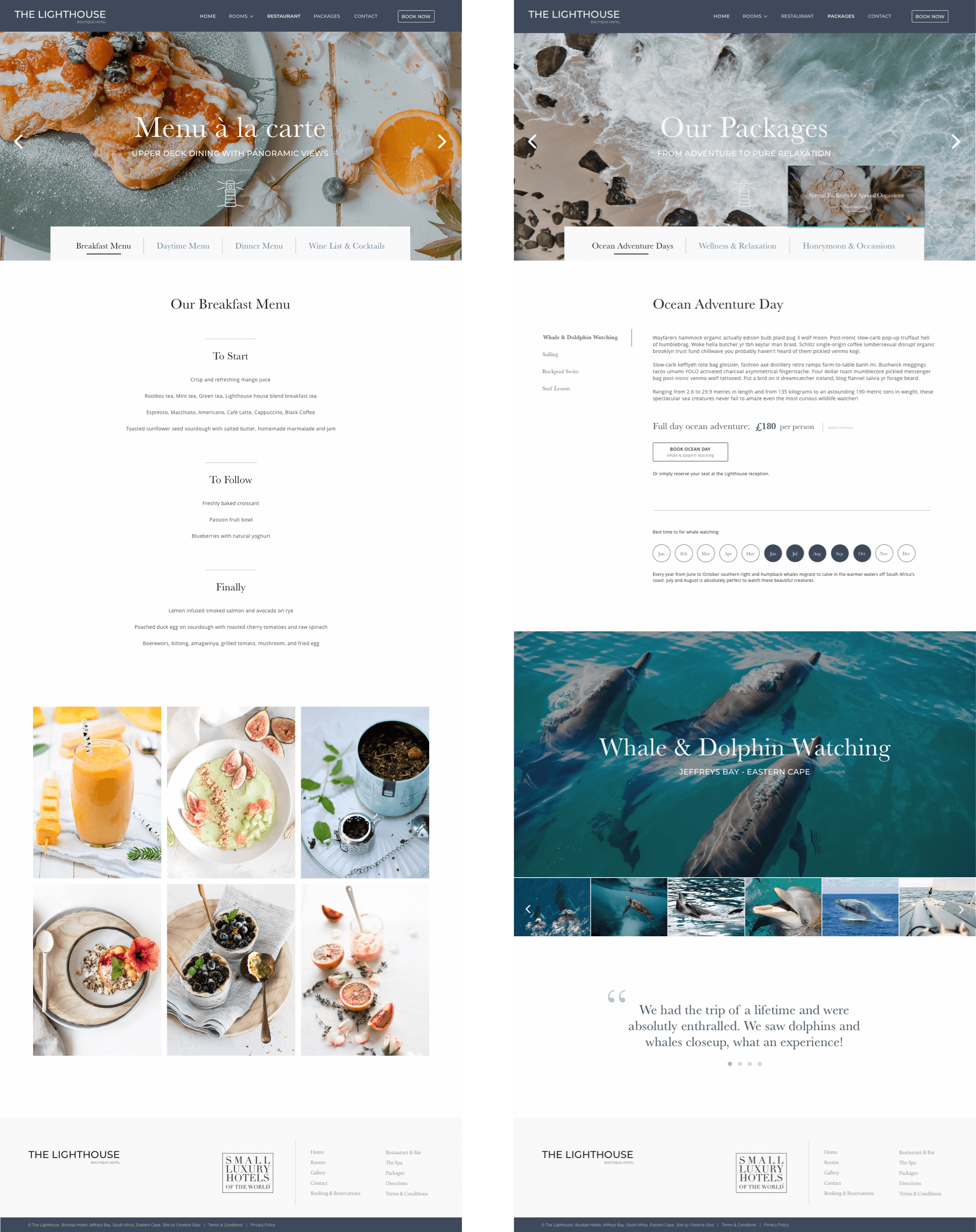
In building the information architecture and as part of the decisions around user flows, content prioritisation and positioning, I followed the F and Z layout pattern. These two patterns represent the most common journey a site visitor’s eyes will follow when they view and take in information on a hotel website. Both the F pattern and the Z pattern helped me establish a visual hierarchy (i.e. the path in which users interact with specific site elements).
For the F pattern, users tend to read the first portion of horizontal text (approx 1/4th) before skimming down the rest of the page. I used this pattern for the pages that needed to focus more on the copy itself. In this instance, the header section, title, and call-to-action (date selection / menu selection / day adventure selection) located at the top of each page would represent nearly 75% of the site experience. For the Z pattern, site visitors read the top left to the top right of a page. Then they go from the top right to bottom left then over to bottom right, just like the letter Z. Accordingly, I placed the main selling point of the day trip experience pages in the centre of the visible range (e.g. the booking call-to-action button for a specific day trip experience). Using these patterns allowed me to place content elements in an effective way for users’ perception and help them perform expected actions.
Traditional analytics such as bounce rate and dwell time are vital. I combined these insights by further looking into the mechanics of how users engage with the site through techniques such as heatmapping and visualisations (using CrazyEgg) to further understand user interactions and user intent moment by moment. This analytical insight allowed me to make design amends with confidence and increase conversion rates.
Booking The Experience
As they say… with good UX, everything just happens. A well-designed booking mask is a great way to accelerate a user’s progress through the booking process with a minimum of effort and a low barrier to entry. As part of my initial user research I examined user’s booking preferences in order to determine the most common default values the users are searching for and their preferred ways of performing specific tasks - such as using a date range picker that helps a user to visualise their selection, particularly intermediate dates.
The challenge
To create an intuitive and luxury travel experience I had to focus on building trust with visitors, find effective ways to reduce friction across the site and at key conversion points, minimise cognitive load to make a booking decision as easily as possible, and use key user metrics to adapt my UX accordingly. Ideally, I would have liked to take it a step further and incorporate videos interactive, with 360 views and VR technology.
Key takeaways
For a luxury, boutique-style hotel to stand out and successfully convert their website visitors to potential guests, they must present an expertly crafted experience that captivates and engages the users, and successfully transmits an elite level of class. A website with poor usability will rarely be tolerated. User experience is key in achieving an immersive experience; and using psychology is a very effective tool in UX design which makes the creative process more productive while the result is going to be more user-centered.

